Airshare
A reskinned website for a fractional aircraft ownership company
Idea
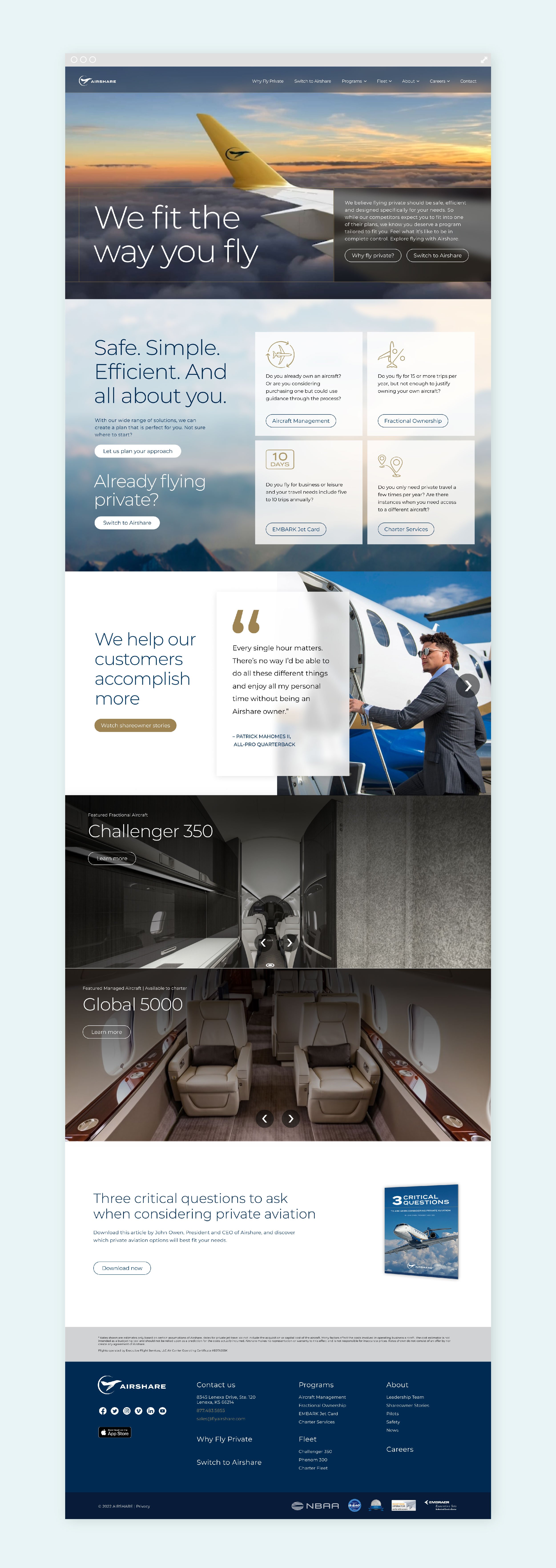
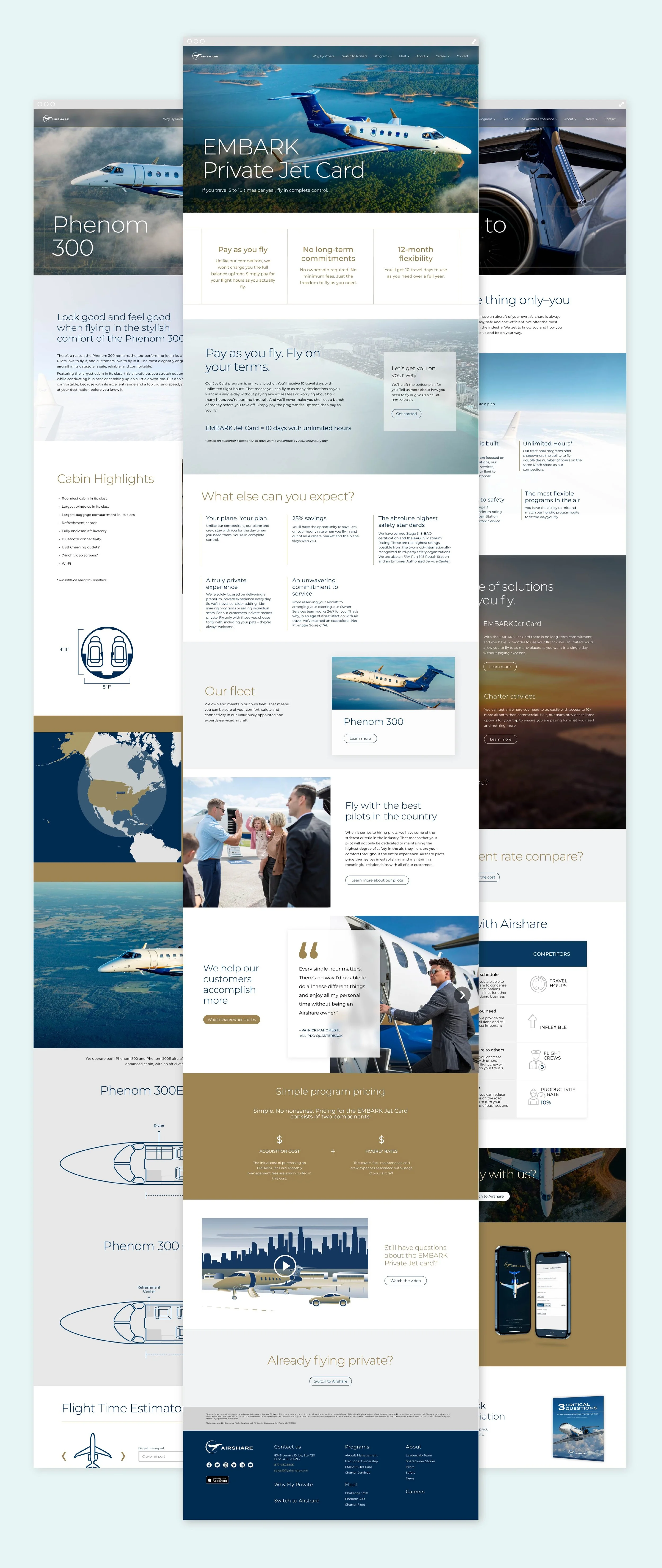
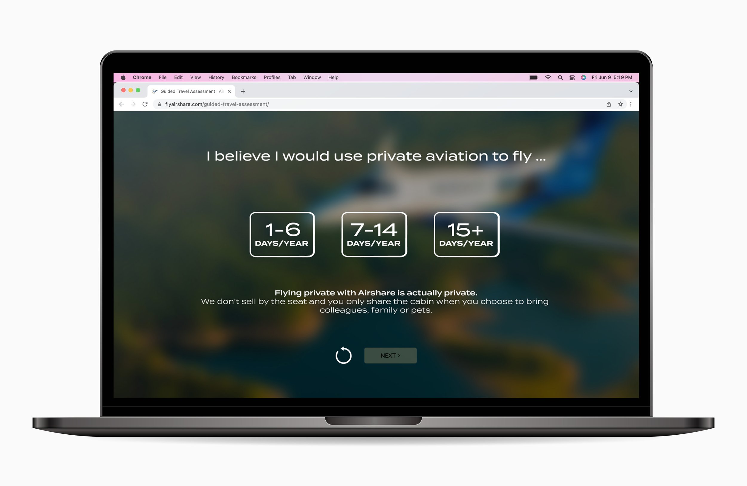
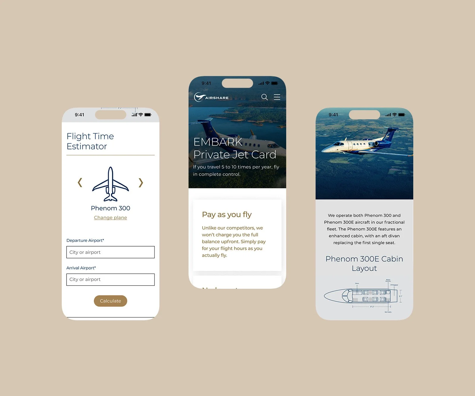
VMLY&R was tasked to update an outdated website as well as create a guided selling tool that Airshare could leverage so that their online platform closer aligned to their goals.
OVERVIEW
Role Senior Experience UI Designer
Tools Figma / Illustrator
Team VMLY&R / Airshare
Time June 2022 — Jan 2023
Problem
Airshare’s current site didn’t have the right messaging or tools so that a new or returning customer could get all of the information they needed in a clear and direct way.
Airshare is best known for fractional jet ownership. And even among existing fractional customers, other major Airshare services—like the EMBARK jet card, aircraft management and charter—fly below the radar.
They lose major account opportunities to competitors who are perceived to have more to offer.
SOLUTION
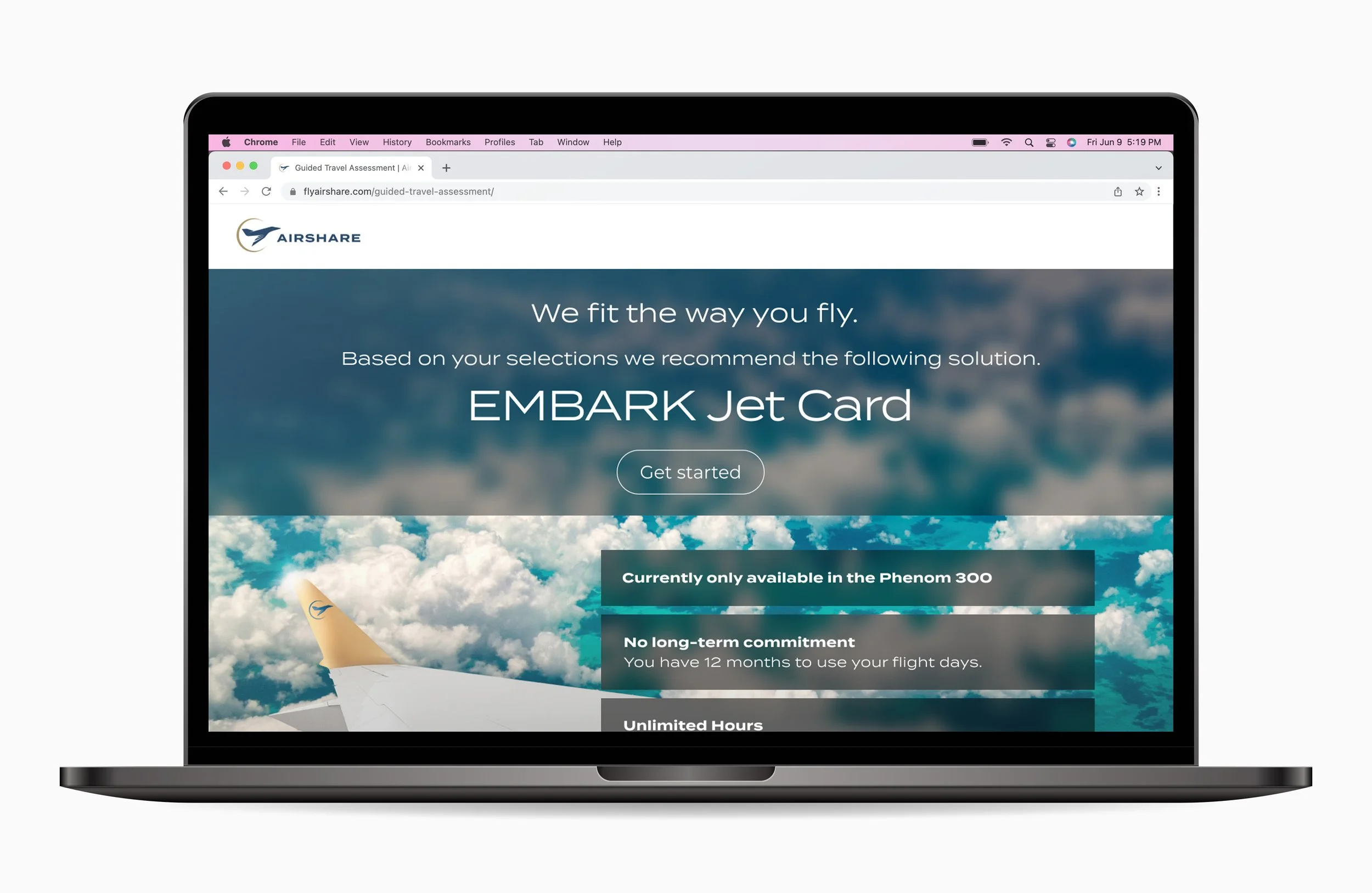
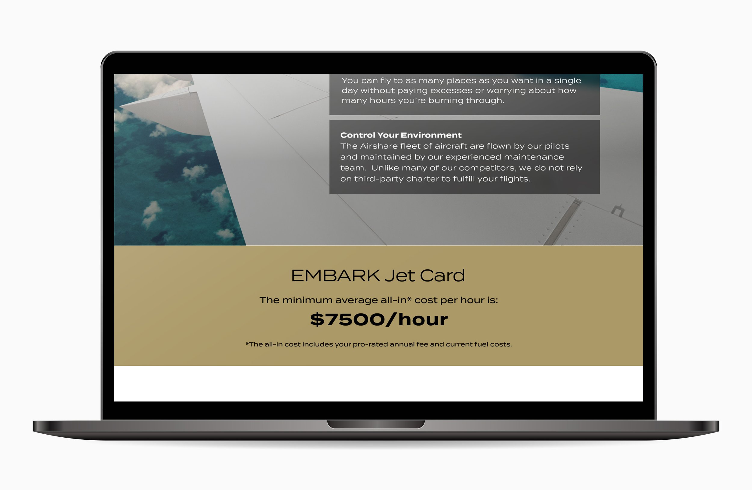
Airshare wanted their site itself to be more of a selling tool rather than ‘brochure content’. Establish Airshare’s brand perception as a one-stop shop for all travelers’ private aviation needs. And as the safe & simple way to fly private.
New principals
Stake a confident claim in Airshare’s matching ability / service, beyond only Fractional.
Keep the holistic value to the customer at the fore, not simply the individual services we provide.
Resonate across the funnel of prospects, but lead with Fractional & Challenger 350.
Consider how the services messaging hierarchy plays out across how our audience segments.
Ensure we resonate with an audience looking to fly private, to the extend we can.
Take a confident, even “a little chest-pounding” tone. But don’t overextend into cockiness.
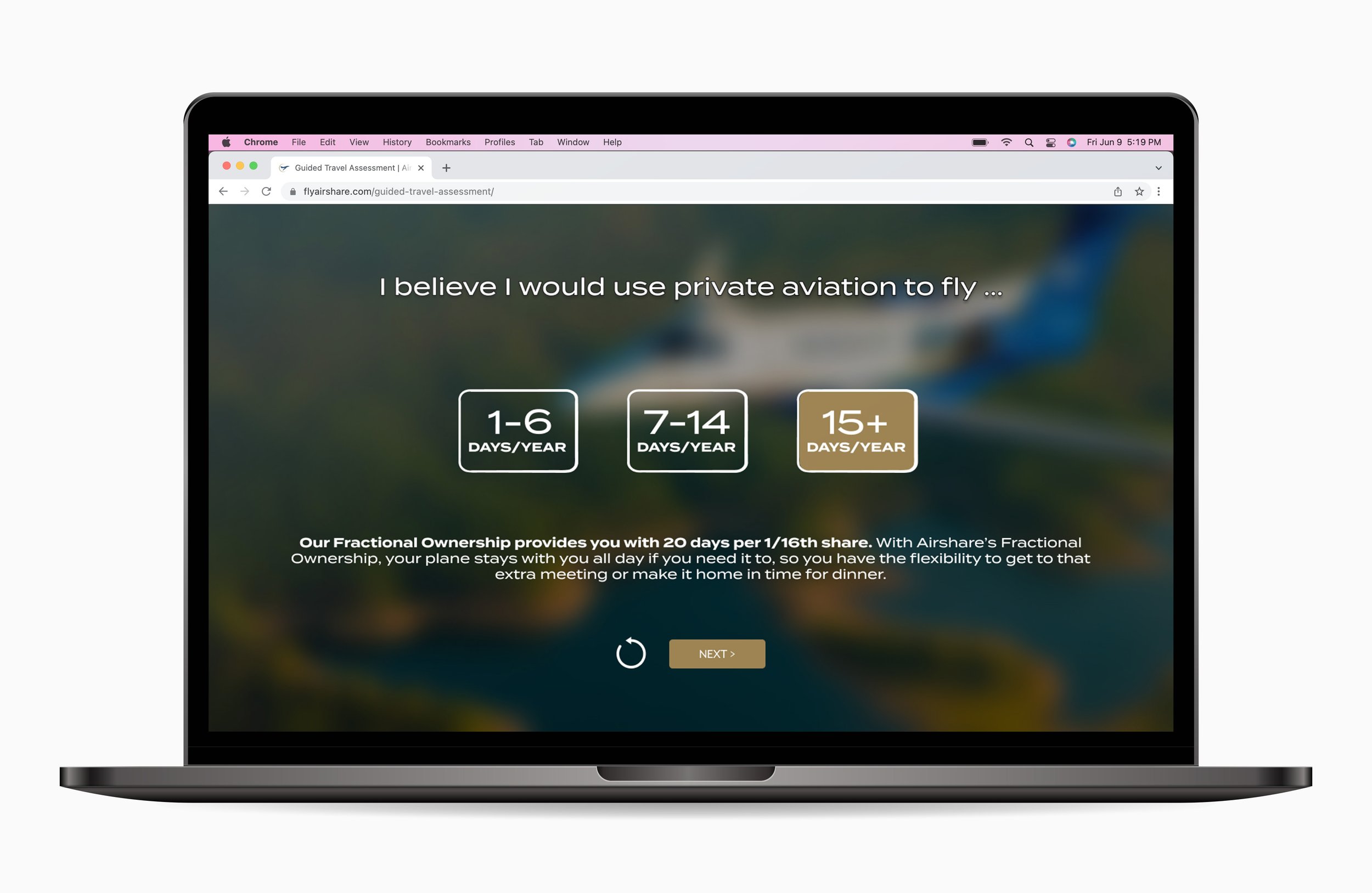
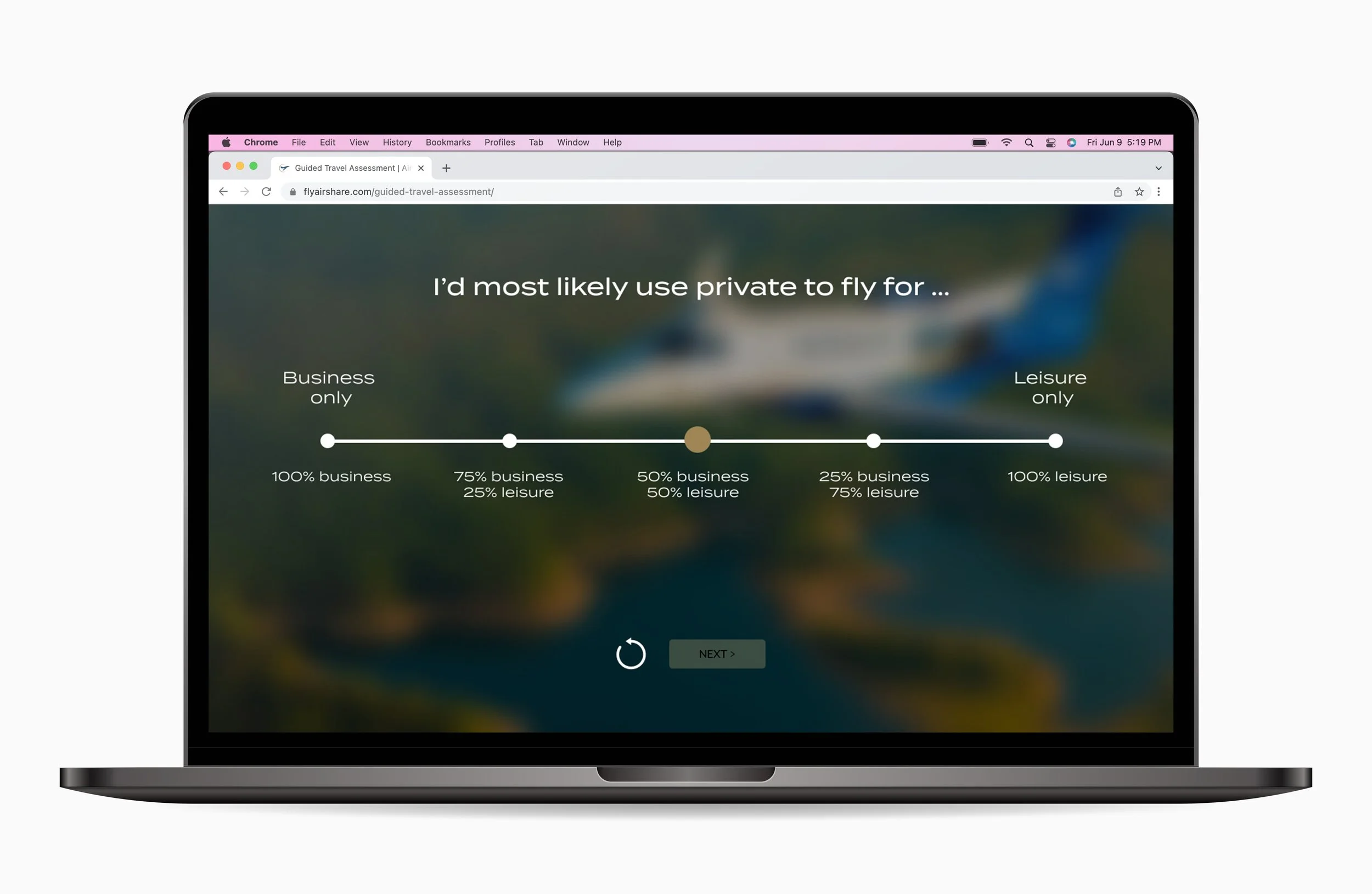
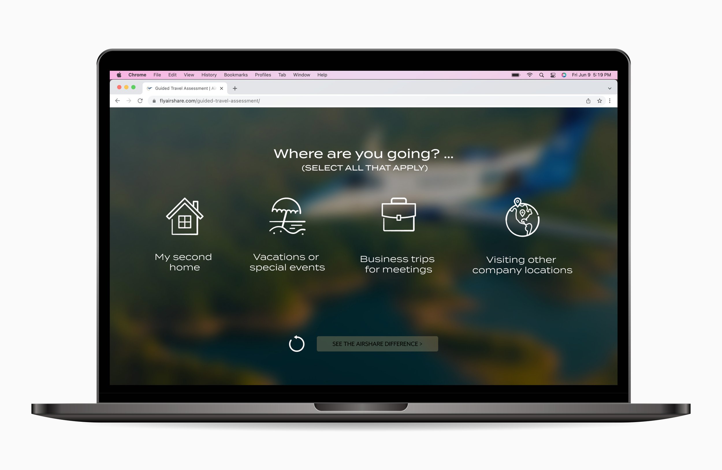
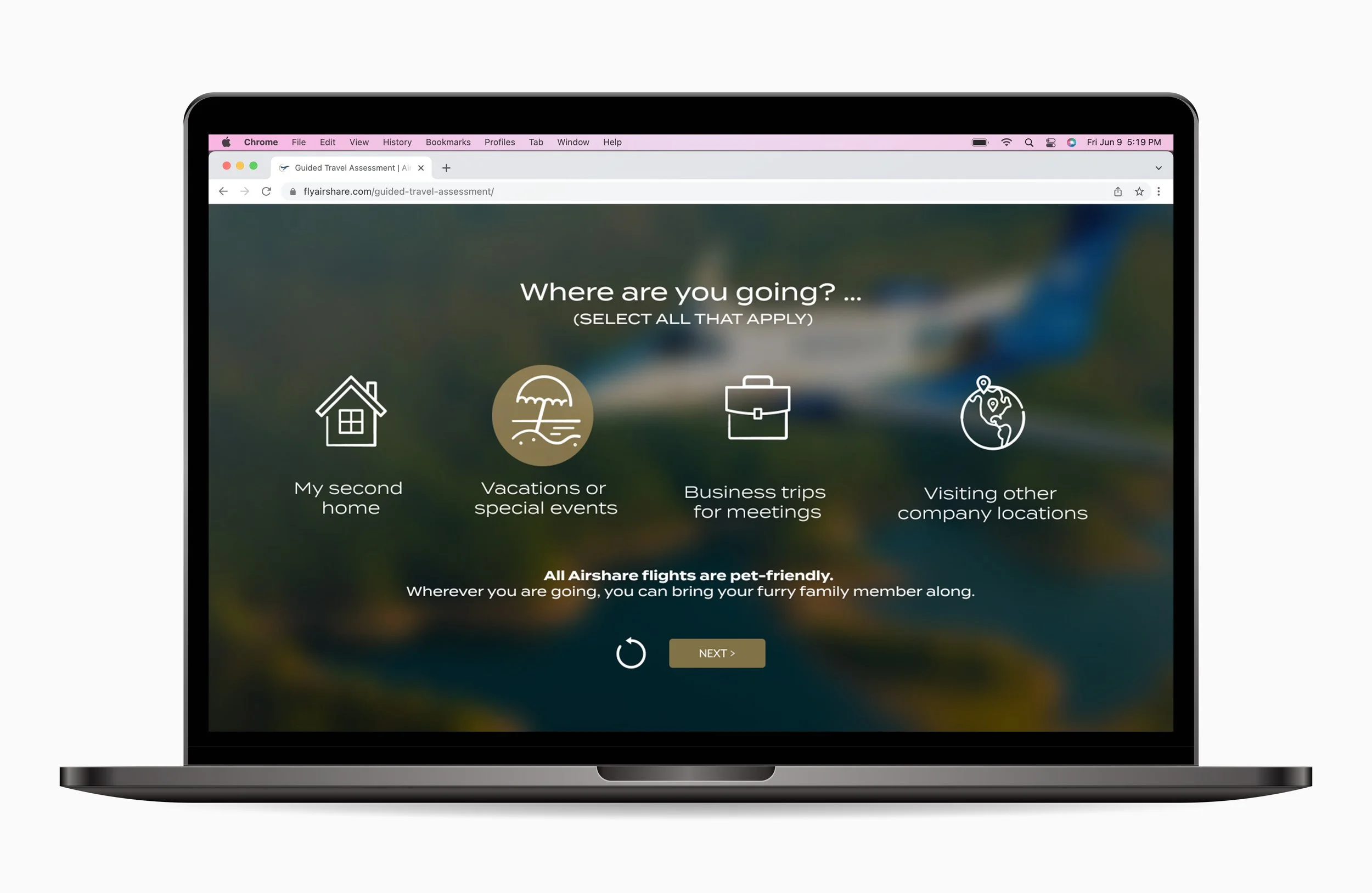
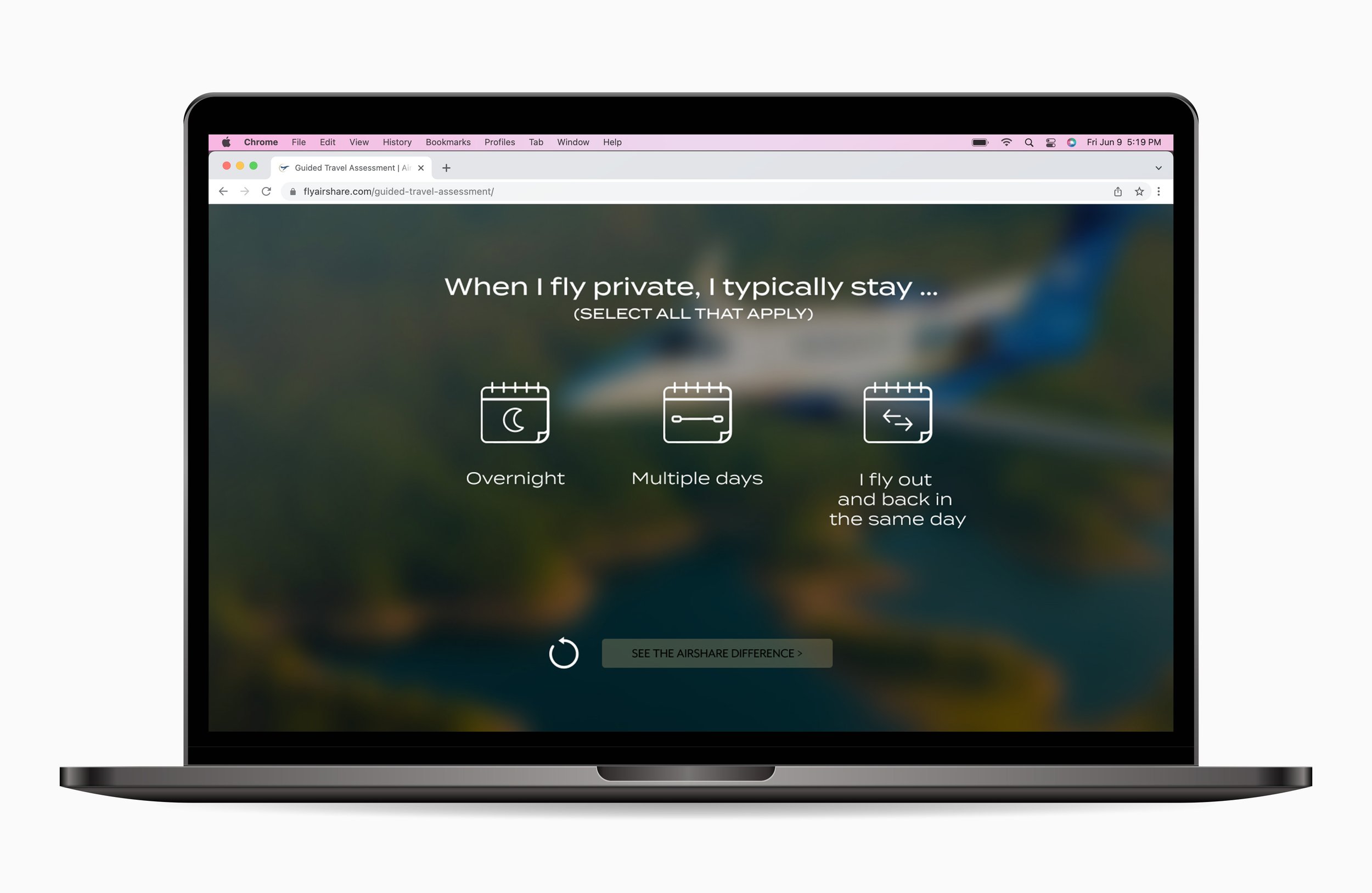
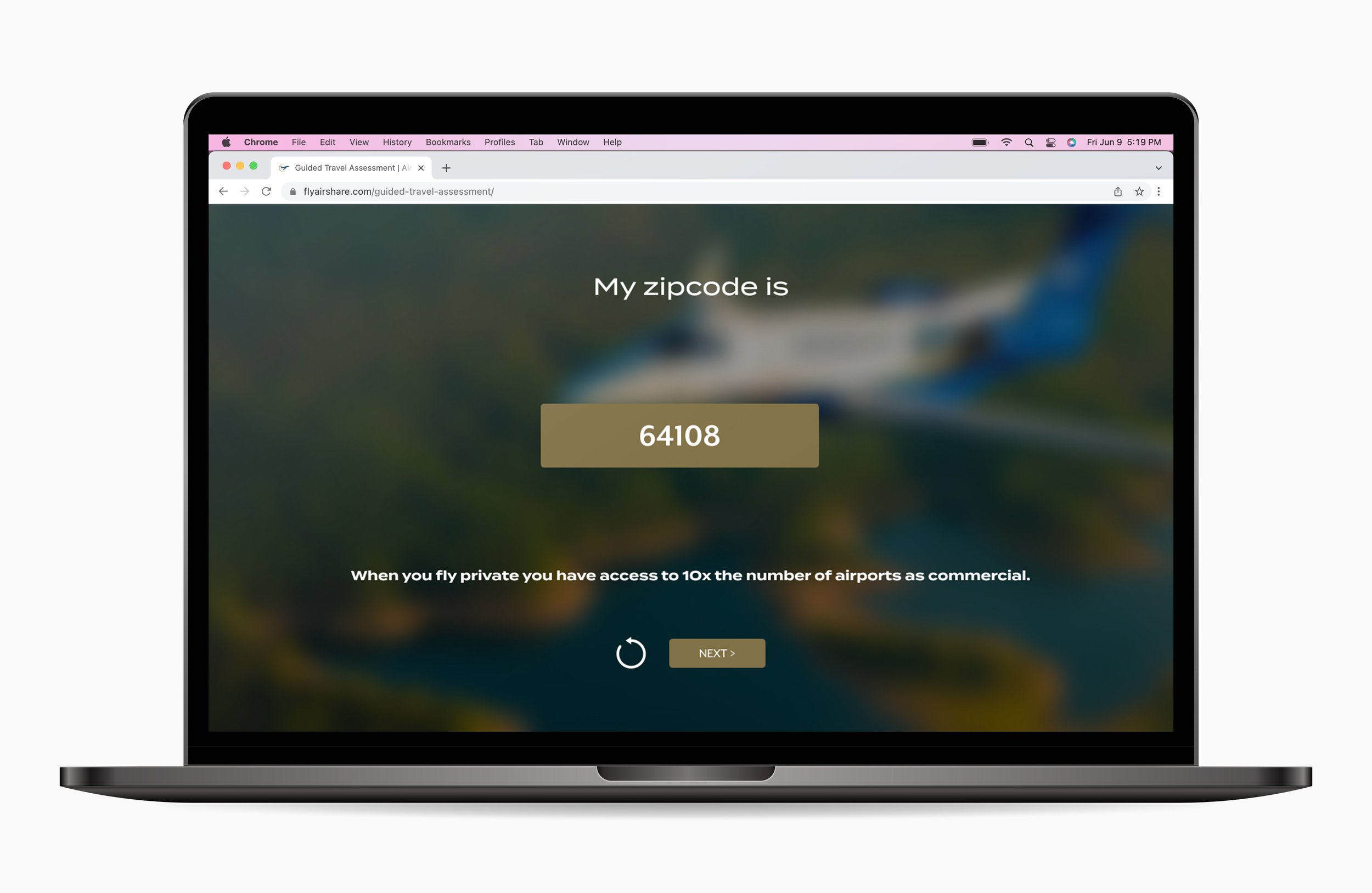
Guided selling
Problem: Guide new customers through the buying process so they:
Understand what Airshare offers
Airshare proves that we can meet their needs
Solution: Make a simple, frictionless, online way to drive qualified leads for the sales team
Process
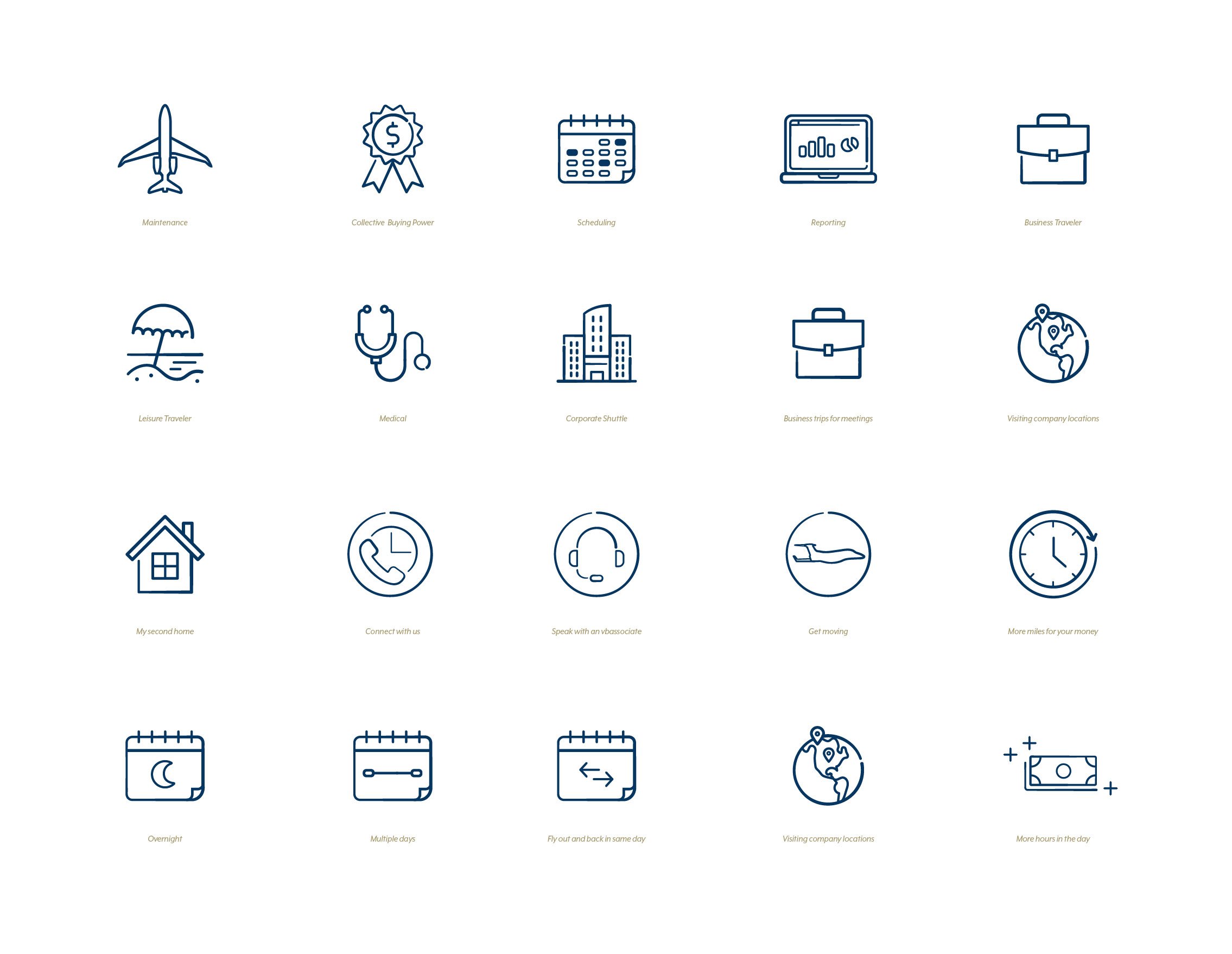
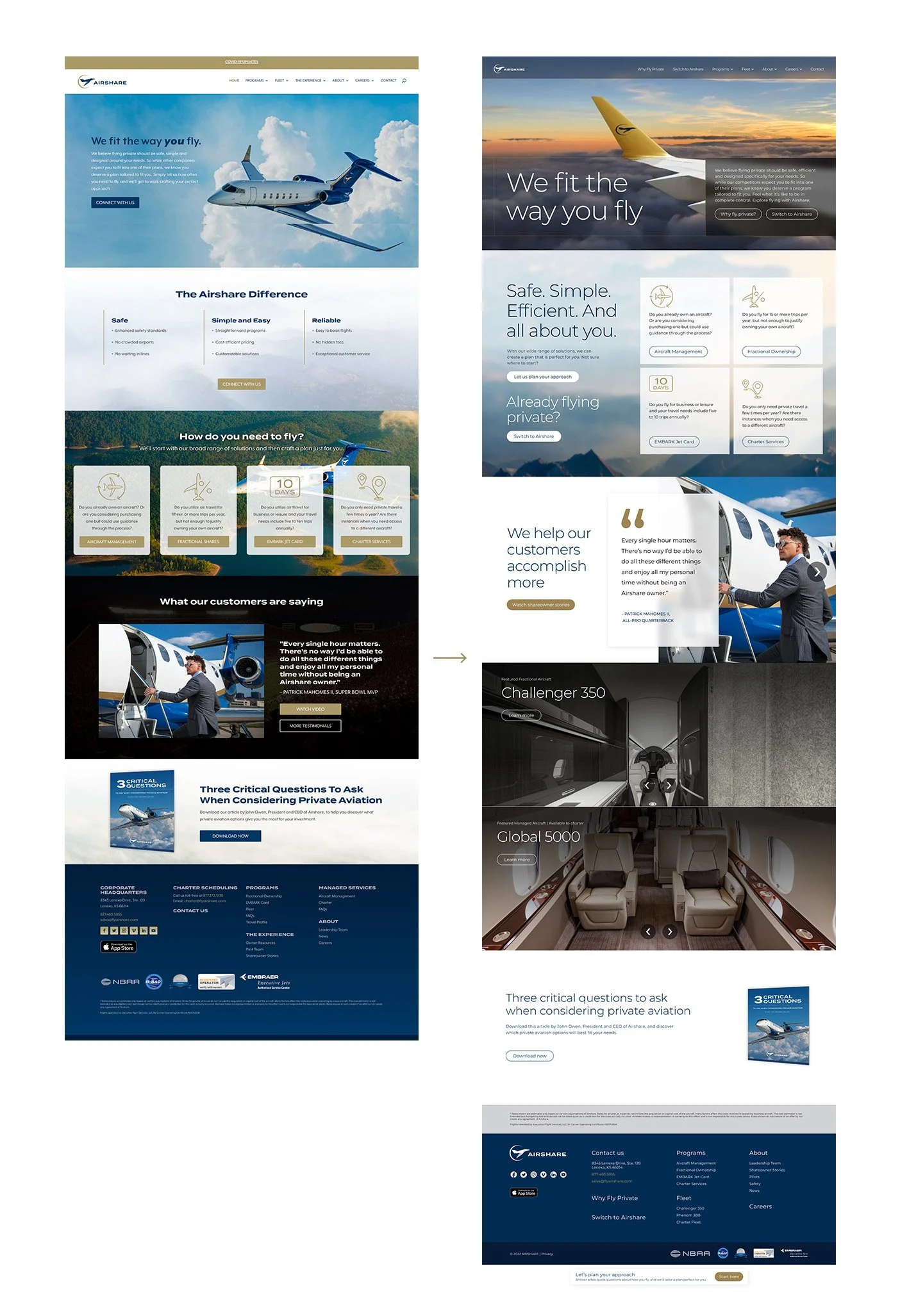
VMLY&R started with an audit of their current content and website compared to their competitors. We first started with the guided selling piece that leads a customer down the funnel whether they’re a new customer or have flown private before. Then went into wireframing a new website structure. I took those wireframes and applied them along with updated copywriting to a new design look and feel that utilized bigger type and an airy approach that utilized more white space and toned back some of the brands darker color palette. I also created a new icon system so that all the iconography across the site could be cohesive.
