Reimagine Ford
A new design system for Ford’s U.S. and Canadian websites.
Idea
VMLY&R was tasked to reinvent Ford’s design system and website, with a focus on the vehicle home pages, using a partner agencies new branding.
OVERVIEW
Role Senior Experience Designer
Tools Figma / Sketch / Jira
Team VMLY&R / Ford
Time Jan 2023 — June 2023
Problem
Ford’s website was outdated and using inconsistent branding and design from many other teams. UX and UI issues of continuity throughout.
Ford’s design system lacked clear standards for how the Ford brand must be expressed. Inconsistencies with icons, buttons, links, alignment, color, imagery, and components created an out-of-date look and led to a falliable online experience.
SOLUTION
How do we maintain Ford’s world established brand while modernizing the new design system? Develop a UX/UI friendly design pattern that establishes a clear and consistent system for Ford assets that can be applied to all US and Canadian sites.
Upgraded design system principles
Craft with Intention
Ford Brand Attribute: Authentic
Make decisions rooted in reason. Be thoughtful. Be purposeful. Be empathetic to a human need at the very moment of need.
Let it Breathe
Ford Brand Attribute: Effortless
Make space. Create focus. Guide. We should be a breath of fresh air in a complex world.
Stir the Soul
Ford Brand Attribute: Passionate
Connect with people. Inspire optimism. Spark imaginations. Create energy. Be bold but relatable. Tell real stories, beautifully.
Advance the Icon
Ford Brand Attribute: Purposeful Ingenuity
Forward advancement is in our blood. We stay true to our visionary heritage by showing up in unexpected ways.
Process
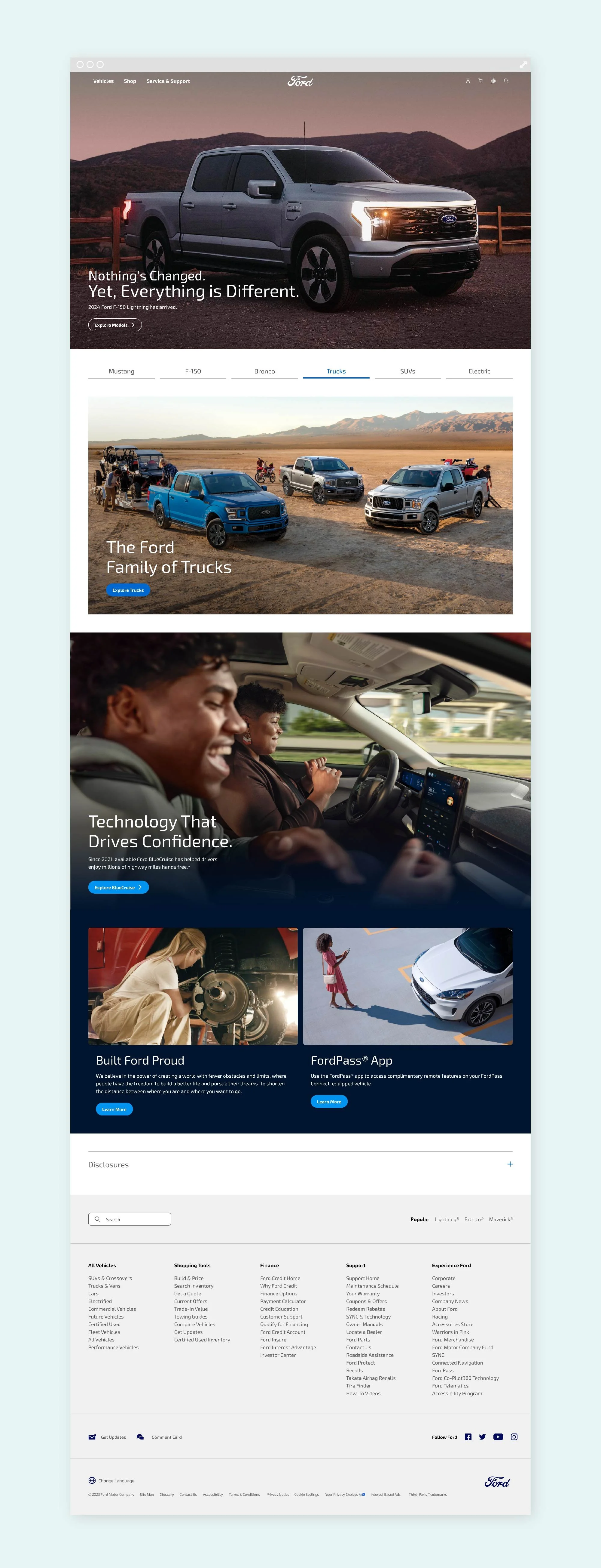
By leveraging Ford’s new design principles we are able to organize and create structure. We strategically use negative space to welcome and create freedom to explore in designs. Prioritized hierarchy of information to clearly guide and communicate what is critical. Removed extraneous elements to say more with less. Used motion to advance the experience and propel the user forward. We provided full specifications to our dev partner so that could easily apply those designs to the current system.
Reskinned and redesigned components
We touched most components for both the vehicle homepages as well as across most of the site. Key ones featured:
01
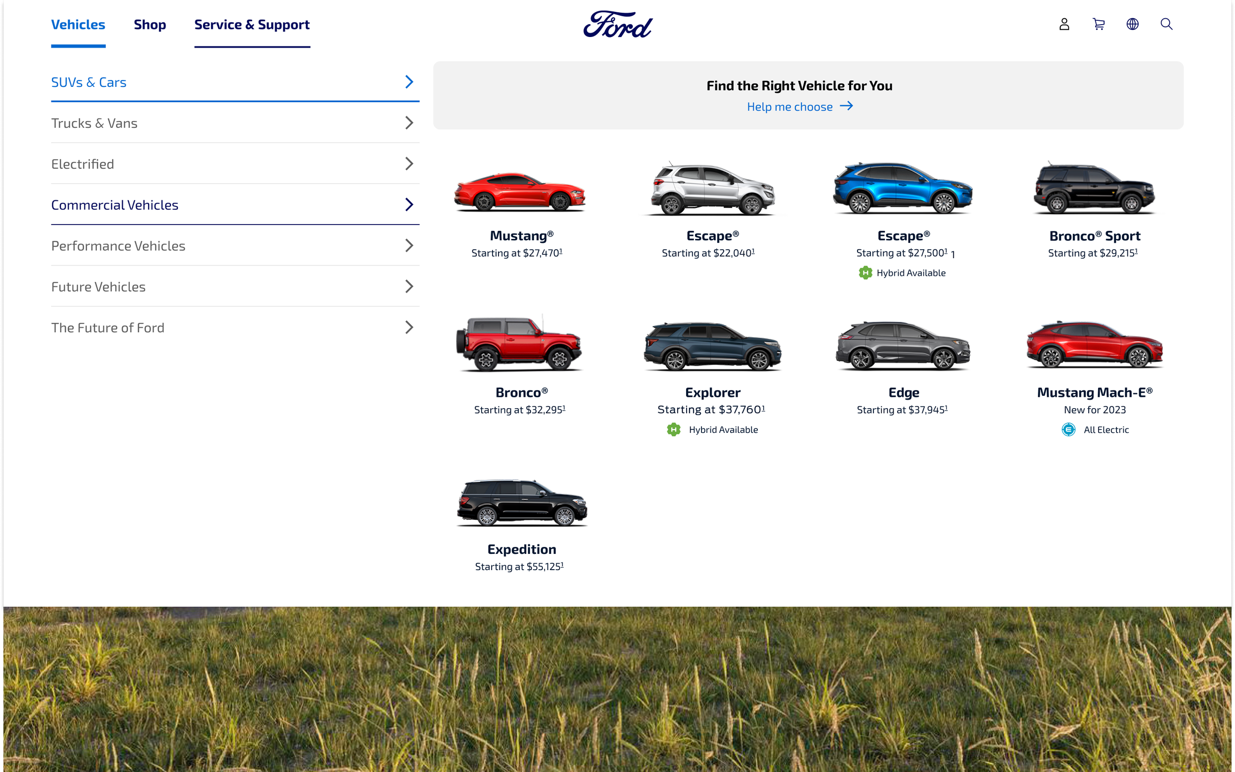
Global navigation
Reduced amount of clickable items for a simpler hierarchy.
02
Billboard, Secondary Nav, & Attributes
Emphasized vehicle imagery and key attributes for easy scanning.
03
Expanded feature, tabs, and horizontal card
Updated UX for tabs make for more seamless experience with visual updates to cards and the expanded feature for a more streamlined and beautiful experience.
04
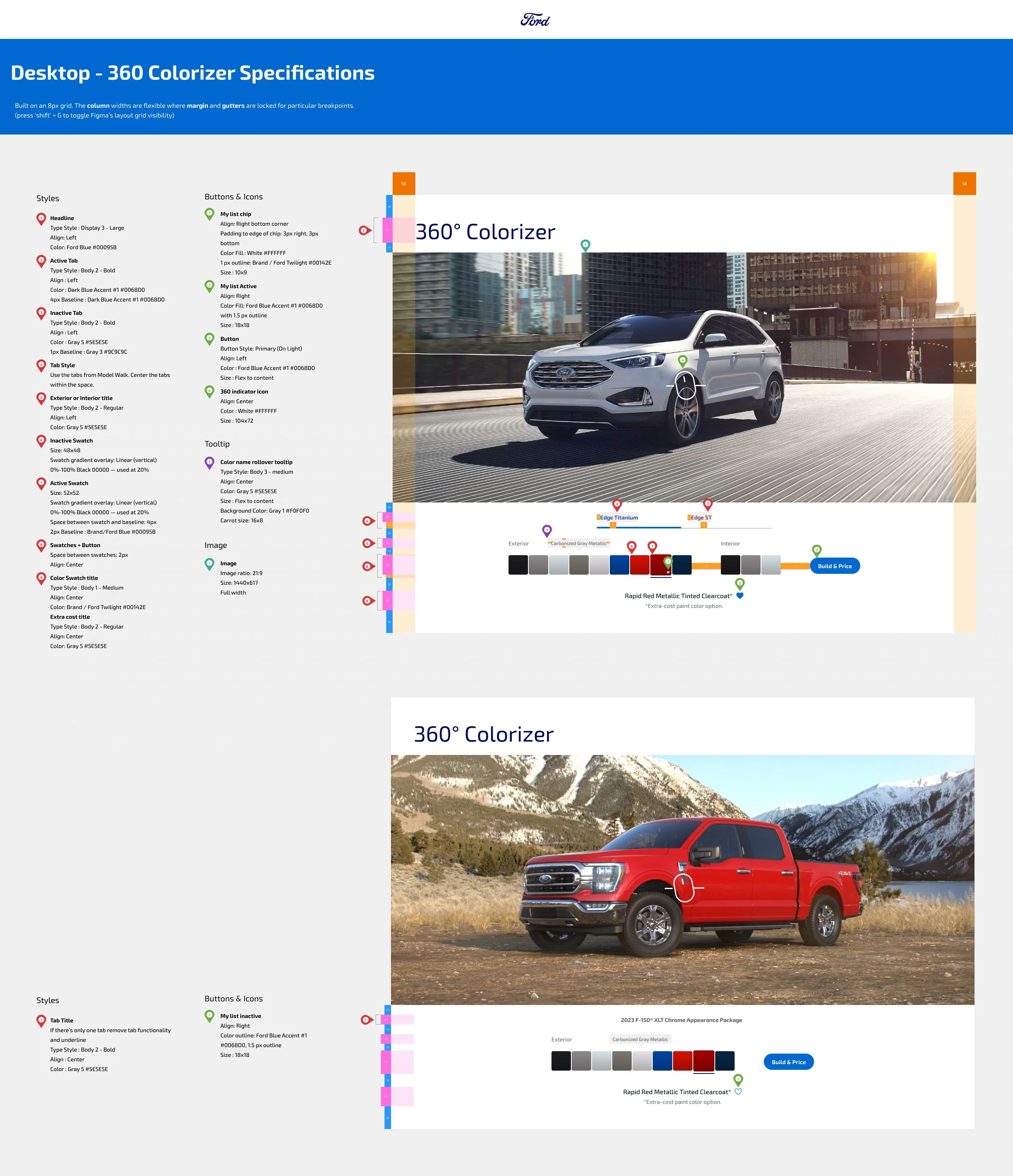
360 colorizer
Showcasing the color variations of each vehicle type.


